Posts tagged with "design"

Design Robbery

After my Perishable Press inter­view, and hav­ing Version 10 fea­tured in a Crestock arti­cle titled “13 Minimalist Designs You Really Should See”, this site has seen a surge in design-relat­ed traf­fic. But increased expo­sure is a dou­ble-edged sword. Higher pro­file sites make you a big­ger tar­get for secu­ri­ty issues, spam, and design rob­bery.

Such as the case with eric-akmal.com.

Does this look famil­iar?

Eric Akmal Dot Com top

Eric Akmal Dot Com bottom

Continue read­ing “Design Robbery”…

Featured at Perishable Press

10.0 is cur­rent­ly being fea­tured at Perishable Press, the first in a series of arti­cles explor­ing min­i­mal­ism in mod­ern web design. From the arti­cle:

Equivocality’s new min­i­mal­ist design is very impres­sive. The site appears clean, bright and refresh­ing and nav­i­gates with nat­ur­al sim­plic­i­ty. Jeff has elim­i­nat­ed clut­ter to focus on con­tent, which is strong­ly uni­fied with­in the site’s sharp, spa­cious design. Attentive vis­i­tors will rev­el in the site’s exquis­ite­ly restrained details, such as the sub­tle tex­ture pro­vid­ed by the bleached back­ground grid, or the dynam­ic inter­play between com­ple­men­tary type­faces, Arial and Avenir. Overall, the design’s the­mat­ic neu­tral­i­ty and uni­ver­sal approach inspire vis­i­tors to relax, focus, and enjoy.

In addi­tion to a detailed site review, Jeff Starr did a mini inter­view with me. I’ve come across Perishable Press sev­er­al times through my WordPress wan­der­ings and it was great to work with some­one I’ve always known but nev­er met.

10.0

Version 10 has been retired here.

Design break­down and inter­view about this ver­sion at Perishable Press, on the Minimalist Web Design Showcase.

Introducing the tenth ver­sion of equivocality.com.

Surgical Style

When approach­ing 10.0, I knew I want­ed a note­book feel, so I used a grid back­ground to give the hint of paper. The idea was min­i­mal­ism. Single col­umn, no more icons, and super stripped-down meta data.

It’s still based on the good old 480 pix­el-wide col­umn, although it’s bro­ken down into a grid with two main columns, which is used for the foot­er and oth­er vary­ing pages. The dates on the left side are bul­lets that break out of the grid to help visu­al­ly sep­a­rate entries, and for a bit of style. Otherwise, it can be a lit­tle bor­ing.

Continue read­ing “10.0”…

Moleskine Cahiers

I’ve offi­cial­ly retired my old note­book, the one I’ve been using since 1999. Starting in my first year of uni­ver­si­ty, it went every­where with me. Long trips, short trips, camp­ing, in the bath, you name it. I even includ­ed it on my list of what I was bring­ing to Hong Kong. It’s filled with so much ran­dom­ness: doo­dles, code, thoughts, quotes, lyrics, bad poet­ry (my own, of course), lists, ideas. One day, I’ll scan them in and doc­u­ment them.

But alas, it’s full.
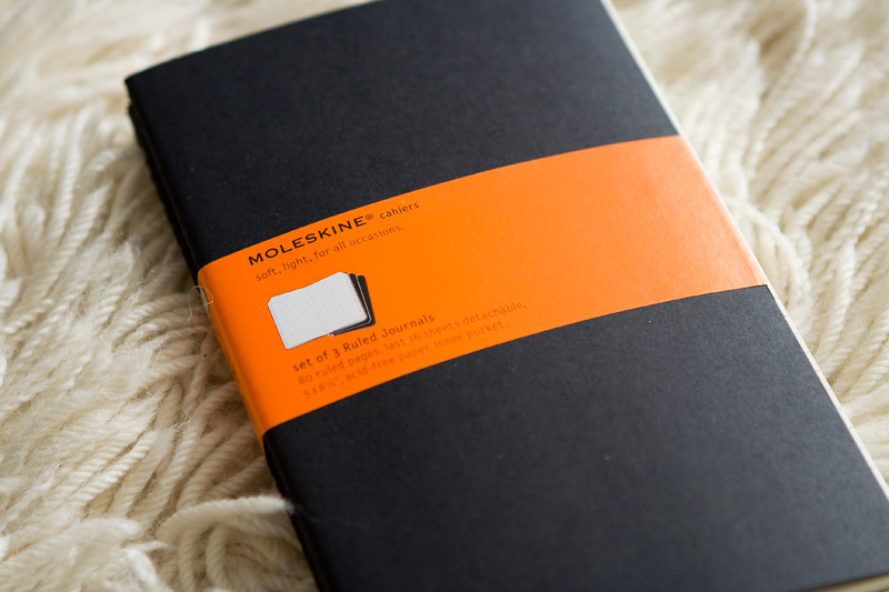
Moleskine cahier

As a replace­ment, I bought a set of three Moleskine Cahiers. They’re thin­ner and lighter, which is exact­ly what I’m look­ing for; it took me over eight years to fill my last one, and I did­n’t need some­thing that would last that long.

I do have sev­er­al pock­et size Moleskine note­books scat­tered around the house and in var­i­ous bags for use in sit­u­a­tions such as rid­ing the bus, but those are rather dif­fi­cult to write in unless sit­ting at a desk due to their small size.

These cahiers are a lit­tle dif­fer­ent. From the insert:

THE MOLESKINE CAHIERS are jour­nals with heavy-duty card­board cov­er, in black and buff with vis­i­ble stitch­ing on the spine. The last 16 sheets are detach­able and there is a wide pock­et for loose notes.

The pages have a delight­ful­ly smooth feel to them, and absorb ink with­out bleed­ing. I’ll be keep­ing one in my back­pack, one in my shoul­der bag, and one in my cam­era bag. I need them now more than ever.

There’s so much to write and so lit­tle time.

A Trip to Zone Closer to Perfection

On a whim, I went to Zone after work. I’ve been in a dec­o­rat­ing mood late­ly. I spent about an hour in there, just gath­er­ing design ideas with what they had.

Thumbnail: Potpourri plate

Thumbnail: Potpourri plate closeup

I picked up a pin­cush­ion plate and some pot­pour­ri for my cof­fee table, replac­ing the glass bowl I had before, and lined it up with the edge of the chaise lounge.

Decorating my house has always been impor­tant to me, but I’ve nev­er rushed into it. Part of the rea­son why it’s so emp­ty right now is because I want to put up my own pic­tures, and I nev­er had enough with which I was sat­is­fied to fill the walls. I don’t want pho­tos of mem­o­ries — what I have at work — I want pic­tures that set a cer­tain mood. Another thing that makes it hard is that I’ve nev­er liked non-func­tion­ing dec­o­ra­tions; can­dles you’d nev­er burn, baubles that don’t do any­thing, knick-knacks that clut­ter shelves don’t make sense to me.

Part of me wants to go out and buy every­thing at once and be set­tled, but anoth­er part of me nev­er wants to fin­ish.

Otherwise, I’d lose the thrill of the hunt, and the plea­sure of adding anoth­er thing that’s just right to the right place.