It started with this tweet by Jay Hori. I was all like, “What? What blog design book?”.
Jay told me the name, so I found a copy of “クリエーターのための3行レシピ ブログデザイン” through HMV Japan, and they shipped it to me.
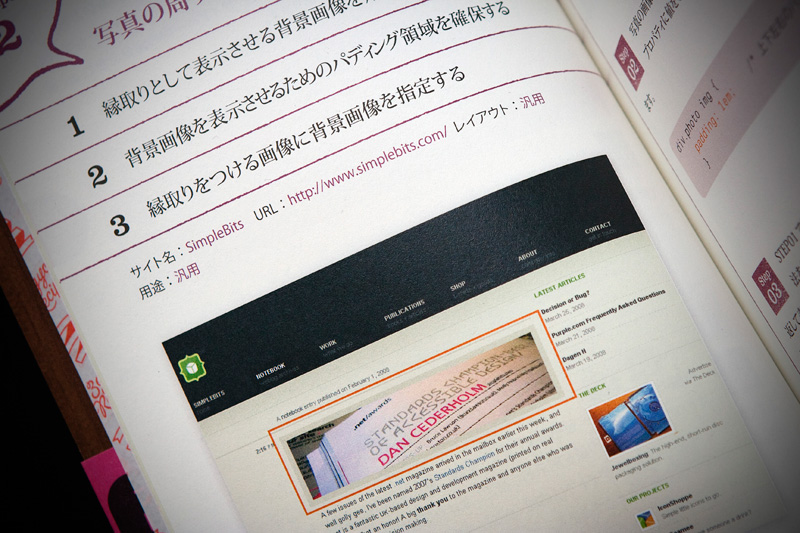
I flipped through the book and noticed that some of my web design idols were in there, like Dan Cederholm of SimpleBits and Shaun Inman1. I wonder if Dan or Shaun know they’re in this book. That’s right, I’m on a first name basis with them. We hang.

When I got to recipe 57 (they label all their design tricks as “recipes”), I saw a picture of my website. My experiences with therapy were on the front page, along with me saying “Sometimes I come out feeling like a monster, like some horrible, fucked-up person.” I guess they don’t use English copy editors, and my curse-filled words may give English speaking Japanese people the impression that Canadians are psychological monsters.
But aside from my own words, I realized it was the only thing I could understand. I had to ask someone who could read Japanese. Someone who just came back from studies there, and wasn’t allow to speak or write English for a month. Maggie. She sent me this:
Your site is being used to explain “Navigation through simplistic icons”. Or like, simple, low-key, uncomplicated. The right side introduces WordPress and Moveable Type and talks about their uses of templates and template customization, then introduces your site as doing something (can’t understand the word) with the background in contrast to how you use simple/clean icons as your navigation.
On the left page, under the screenshot of your site it says “Displaying navigation through minimum design. Designated using CSS, the minimum use of files is excellent.” Bad translation. The way you use your files (I’m guessing this refers to the actual number of pages and stuff on your site) is also quite minimum and that is nice.
Cool.
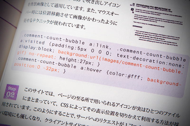
And with the code for my comment bubble right in front of me, I had to wonder about the legal implications. It probably wasn’t legal for them to publish my source code, which is why they didn’t contact any of the owners of the websites to tell them that they were published. I hear the copyright laws are notoriously lax in Japan.
- Regarding his use of the old flash header that was a wave, inspired by anime. Shaun and I were also featured in the Perishable Press minimalism in web design series. [↩]