
When you live with a cat who sleeps on things to mark her territory, you never wonder why your clothes are covered with hair.

When you live with a cat who sleeps on things to mark her territory, you never wonder why your clothes are covered with hair.


Babies seem to have a different expression every second, and the expressions are so innocent. They hide nothing. I like to think each expression reveals the drifting thoughts going on in their tiny little brains. Rather difficult to photograph because the face they wear when you press the shutter release button is invariably different from the one you get.
Rosella here is half-Persian, half-Caucasian. Aside from being so cute you could chew her cheeks off, you can already tell how beautiful her mixed blood is going to make her.

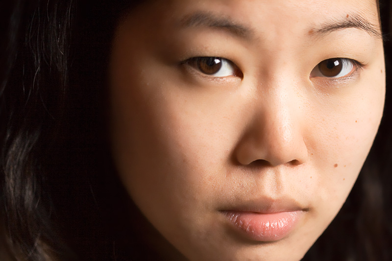
The first thing I notice about a girl is her face, but the eyes are what hold my attention.
Big, round, and pure. They’re the ultimate sign of femininity, because they convey innocence, youth, vitality.
Sometimes, the most intimate and personal thing you can do — from having a conversation to making love — is make eye-contact.
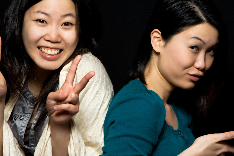
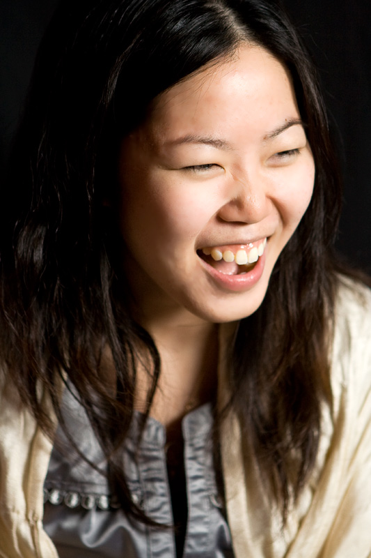
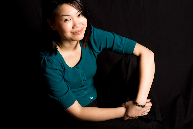


Some more practice with photographing couples. Ellen and Ziny are both med students who used to be roommates. They happened to be in Ottawa at the same time for internships at different hospitals, so it was the perfect opportunity to get them both together for a few shots.
Getting black hair and clothes to show up against a black background is very tricky. I suspect darker textures need their own dedicated light source to increase the exposure.

Some people ask me whether I feel more Chinese or Canadian. While some first-generation Canadians say that they’re neither, I feel like I’m both, because I appreciate and understand things from both cultures. I have the best of both worlds.
I already have a the hanzi character for “tao” on my right wrist, so I got the word “tao” on my left in English. This tattoo serves two purposes: as an expression of this dual heritage, and as another reminder for me to follow the tao.
I went back to Jay at New Moon, who did an awesome job on my first tattoo. When I walked in, he had the latest Mars Volta album on, which I didn’t even know was out until that day. Most of the time was passed comparing them to Tool, two of our favourite bands1.
Can you tell when he’s going over my artery? (Hint: I start to swear)
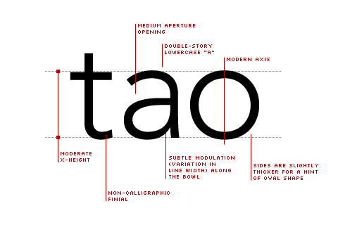
The three-letter word is written in Avenir. As the Humanist, sans-serif typeface designed by Adrian Fruitiger (also used for the title and menu of this site), it’s my favourite font. Clean, sharp, minimalist, and legible. The most distinguishing part, as with most good fonts, is the double-story “a”, which increases legibility.
I had over a dozen variations, at different point sizes, kerning values, and weights. I wanted the weight, size, and position to balance with the one on my right wrist. In the end, I went with one that was 63.78 points, and the 35 “light” weight.