
Version 10 has been retired here.
Design breakdown and interview about this version at Perishable Press, on the Minimalist Web Design Showcase.
Introducing the tenth version of equivocality.com.
Surgical Style
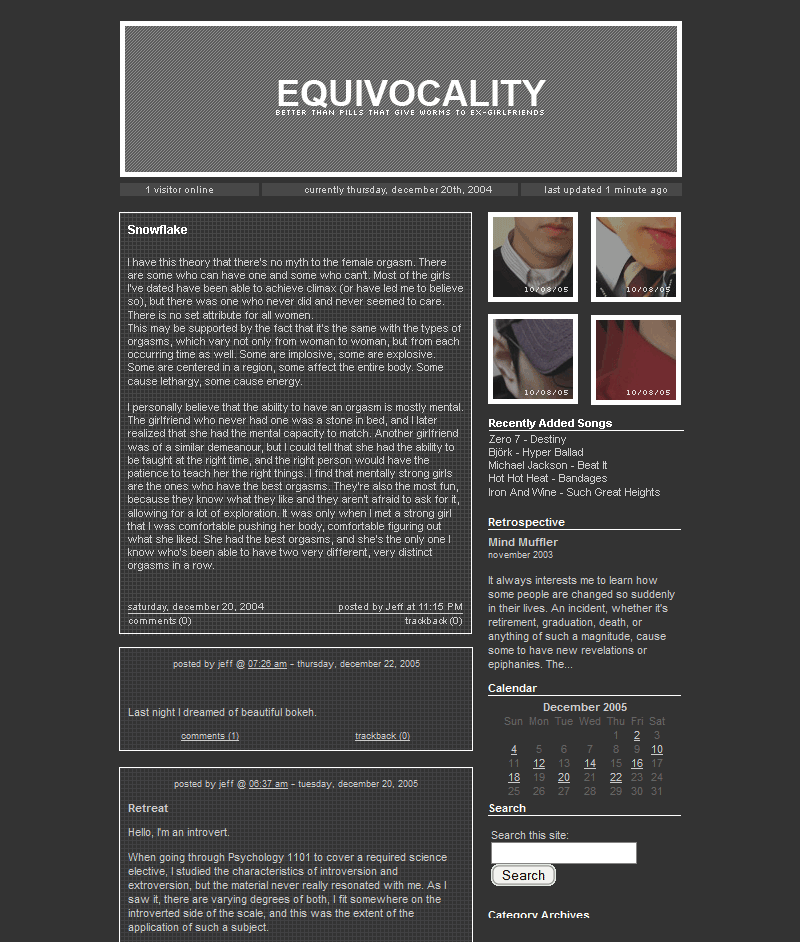
When approaching 10.0, I knew I wanted a notebook feel, so I used a grid background to give the hint of paper. The idea was minimalism. Single column, no more icons, and super stripped-down meta data.
It’s still based on the good old 480 pixel-wide column, although it’s broken down into a grid with two main columns, which is used for the footer and other varying pages. The dates on the left side are bullets that break out of the grid to help visually separate entries, and for a bit of style. Otherwise, it can be a little boring.
Moving on from 9.0
Version 9.0 was presented without fanfare. It was more of an evolution than a revolution; I reorganized the grid to be symmetrical, increased the overall contrast, and modified the header, but that was it.
It lasted about two weeks.
Even though I had version 8.0 going for a couple of months, it didn’t last as long as I hoped. The empty space started to annoy me, and it wasn’t clean enough. The holidays gave me a little time to make 9.0 from scratch, both design and code, and doing this, even though I changed it soon after, gave me a good direction of where I wanted to go.
A Return To Form
One day, I was looking at my old sites and came across version 4.0, created back in 2005. I was blown away by the elements I used, before I ever read any design books. It made me wonder why I changed it in the first place. Those were the days of Movable Type, with tiny grey type on a black background, and it was my most popular design.
This design closely resembles 4.0, except the colours are inverted. Of course, a few amateurish mistakes have been fixed, typography has been tweaked, and there’s no more double-column layout that creates unbalance from one being shorter than the other.
Hello Arial
The base font for text has changed from Verdana to Arial. While both are sans-serif fonts, the lower cap height combined with more rigid curves of Arial create a modern, industrial feel. I flirted with the idea of going with completely web-safe fonts for titles as well, but I couldn’t give up on Avenir which is a part of the equivocality.com identity now.
Goodbye Scriptaculous
No more Scriptaculous menu effects. As fun as they were, they could be extremely slow on older systems. They also added extra Javascript runtime libraries to the load time, and didn’t work in Opera. The trade-off wasn’t worth it.
Re-organization
Sections have been re-organized. The About page now houses the Colophon and Contact info.
My Twitter update bar has been dropped, and placed in the Asides section, along with my most recent flickr photos. I still Twitter as furiously as ever now.
Lighter, Brighter, Life
As things become clearer in my life, I’m beginning to make bolder statements. The grey-on-grey of 8.0 started to feel too bland after a while, even though it was more than a 60% contrast. (I can remember my first designs, hosted on friends servers before equivocality.com even existed, and they were mostly black.)
“Lighter, Brighter, Life” has been the tagline for my designs since 7.0, but really, it was all somewhat relative. This is the first time — ever — that I’ve gone with a pure #fff background. I wanted something even lighter, and more airy with higher contrast. As a result, entry titles are one weight heavier than before, and text is pure black.
10++
Hard to believe that equivocality is in it’s tenth incarnation. I realized that my re-designs come from a want for simplicity, and a want for complex, well-organized intricacy, which are somewhat contradictory. When I get tired of one, I make a new layout for the other. I’d love to be able to just stick with one design, but it’s in my blood to tweak.
I’m extremely happy with this version, but history has taught me that this may change soon enough.
Screenshot
Version History
10.3 — 2009-06-25: The lifestream. I’ve adapted my previous layout to a lifestream, which not only latest blog entries, but my activity on other services as well, namely Flickr and twitter. Read more about version 10.3.
- Added twitter and Flickr posts as separate entries, under new categories “tweets” and “snaps” respectively.
- Added a navigation bar below the header
10.2.3 — 2008-10-19
- Added a small bar at the top to display the most recent tweet from Twitter.
10.2.2 — 2008-08-29
- Added Gravatar support for comments (opted for this over stylized author comments)
10.2.1 — 2008-04-26
- Stylized author (my) comments so they look different from reader comments
- Cleaned up source for entries with closed comments
10.2 — 2008-04-16: With WordPress 2.5, tag support is much better implemented. I figured it was time to add tag support to this theme. Now I have to go through six years of entries and tag each one.
- Moved the comment link and comment count outside to a bubble in the main content to the left
- Thanks to the snazzy comment bubble, I can now add the year to the side meta without it looking strange. Huzzah!
- Added tag links to each entry
- Added the tag cloud to the archive section
- Started pulling random flickr photos for the asides section, instead of the latest from RSS
10.1.2 — 2008-02-09
- Fixed blockquotes in Internet Explorer
- Got rid of the year in the date meta. Still unsure about this one. I may change it later
- Made the title graphic pure black.
10.1.1 — 2008-02-05
- Added Photography and Portfolio sections
- Replaced “Recently” link from menu with “Photography”, and rearranged items
- A few under-the-hood changes, such as entry padding structure
Ok well since I love graph paper…I love this layout.
I know the feeling. There’s something clean and technical about graph paper that makes you want to create something brilliant.
(I preferred the previous one, but I’m a stickler for script.aculo.us. :’-(
I adored Scriptaculous too, but it didn’t fit in with the minimal feel of this theme.
Can I download the theme ?
No, sorry, this is my personal, private theme.
this layout is fantastic!